Crafting Compelling Sales Pages in Kajabi: Design & Copy That Converts
Jun 05, 2025
If you're building your online course or coaching offer on Kajabi, your sales page is one of the most important assets in your business. It's not just a digital brochure — it’s your 24/7 salesperson. And if it isn’t converting visitors into buyers, you’re leaving money on the table.
In this post, we’ll cover how to craft high-converting sales pages on Kajabi, blending smart design with persuasive copywriting. Whether you're launching your first offer or refining an existing one, these strategies will help you turn more browsers into buyers.
Free 30-Day Kajabi Access – Start Creating Now
Why Your Kajabi Sales Page Matters
First impressions count. Your sales page is where potential students decide whether your course is the right solution for their problem. A well-structured, emotionally resonant sales page builds trust, showcases your value, and guides visitors toward a clear “yes.”
1. Start With a Strong Headline
Your headline is the hook. It needs to instantly grab attention and make the reader want to learn more.
Best Practices:
-
Focus on outcomes, not features
-
Be clear, not clever
-
Use emotional language (“Finally launch the course you’ve been dreaming about”)
Example:
“Launch Your First Online Course in 30 Days – Even if You’ve Never Sold Anything Online Before”
2. Tell a Story That Resonates
Kajabi gives you the flexibility to add full-width text, imagery, and videos to tell your story. Use this to your advantage. Your story helps your audience see themselves in your journey — especially if you've overcome the problem they're struggling with.
Include:
-
What challenge you faced
-
The transformation you experienced
-
How your course can help them do the same

3. Break Down the Offer Clearly
Clarity sells. Use Kajabi’s layout blocks to visually outline what’s included in your course or membership:
-
Number of modules
-
Bonuses
-
Time commitment
-
Special perks (like community or coaching calls)
Use icons, checklists, or accordion blocks to make it scannable.
4. Add Social Proof
Kajabi makes it easy to embed testimonials, video reviews, or screenshots of messages from happy students. Sprinkle these throughout your page to build credibility and reduce buyer hesitation.
5. Create an Irresistible Call-to-Action (CTA)
Don’t just write “Buy Now.” Make your CTA about the transformation.
Better CTA examples:
-
“Start Building Your Course Today”
-
“Join the Program and Get Instant Access”
-
“Let’s Launch Together – Enroll Now”
Pro Tip: Use Kajabi’s countdown timer blocks during launches to add urgency.
6. Keep the Design Simple and On-Brand
Kajabi’s page builder gives you full control over fonts, colours, and layout — but that doesn’t mean you need to use every feature.
Design Do’s:
-
Stick to 2–3 colours max
-
Use large, readable fonts
-
Keep plenty of white space for a clean look
-
Use real photos if possible
A cluttered page distracts from your message. Less is more.
7. Optimise for Mobile
Over 50% of your traffic may come from mobile. Kajabi automatically adjusts your layout, but it’s worth double-checking on your phone.
Checklist:
-
Are your buttons tappable?
-
Does text resize properly?
-
Is the layout stacked logically?
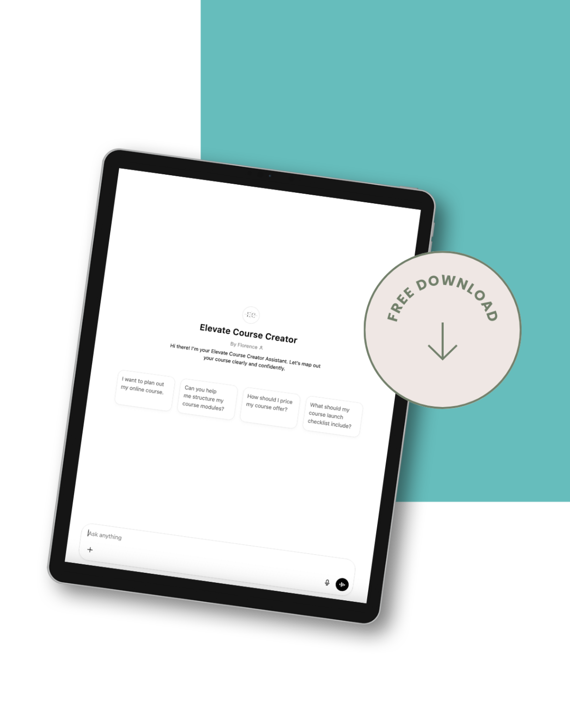
Course Creators: This Free Kajabi Assistant Will Save You Hours
8. Use SEO Best Practices
Don’t forget: Kajabi pages can rank on Google! Optimise your sales page by:
-
Adding a keyword-rich meta title and description
-
Including your course’s core keyword in your heading and subheadings
-
Writing alt text for your images
-
Naming your URL clearly (e.g.
/launch-your-course)
Final Thoughts
A powerful sales page doesn’t happen by accident — it’s the result of intentional design and messaging. With Kajabi’s robust builder and your authentic voice, you can create a sales page that not only looks great but also sells.
Focus on clarity, connection, and conversion — and your sales page will become one of the most valuable parts of your online business.