Is Your Kajabi Setup Costing You Sales? 5 Mistakes Most Creators Don’t Realise They’re Making
Apr 08, 2025
If you’ve built a Kajabi site, uploaded your course, set up your checkout... and still aren’t seeing sales roll in, you’re not alone.
Kajabi is one of the most powerful platforms for course creators, but if your setup isn’t fully optimised, it can quietly leak revenue—even when everything looks fine on the surface.
The truth is, most creators are making small but critical mistakes in their Kajabi setup that are costing them sales without even realizing it.
In this post, we’ll break down 5 of the most common Kajabi setup mistakes—and show you how to fix each one to boost your conversions and customer experience in 2025.
1. Confusing or Cluttered Homepage Design
Your homepage is often the first impression someone has of your business. If it’s unclear what you do or how you help, visitors bounce.
Common problems:
-
Too many calls-to-action (CTAs)
-
No clear messaging about who the course is for
-
Generic copy like “Welcome to my site” or “Start here”
Fix it:
Use your homepage to guide visitors to one goal—usually your lead magnet or main offer. Include a clear headline, subheading, and one CTA above the fold. Use Kajabi’s built-in sections to create a clean, conversion-focused layout.
🛠 Pro tip: Kajabi’s “Hero” section is perfect for showcasing your value proposition in 1-2 sentences, with a bold CTA button.
Here's a 30-day Kajabi trial for you!
2. Using Default Kajabi SEO Settings
Kajabi gives you full control over your page titles and meta descriptions—but many creators never customize them, meaning their site doesn’t rank well on Google.
Common problems:
-
Duplicate page titles (like “Home – My Site”)
-
Missing meta descriptions
-
No keyword strategy
Fix it:
Customize every page’s SEO settings with keyword-rich titles and clear, compelling meta descriptions. Think about what your ideal customer might Google, and use that language.
Example:
Instead of: “Course”
Use: “Learn How to Start a Photography Business – Online Course”
3. Weak Offer Pages That Don’t Convert
Your Kajabi sales page isn’t just a place to drop your course details—it’s your 24/7 salesperson.
Common problems:
-
No clear transformation or outcome for the student
-
Walls of text without visuals or proof
-
A single pricing option without bonuses or urgency
Fix it:
Structure your offer page to lead with the result your course delivers, not just its features. Add testimonials, FAQs, a guarantee, and an order bump. Use Kajabi’s sections to break up content visually.
🛒 Use urgency features Kajabi offers—like limited-time bonuses or countdown timers—to increase conversions.
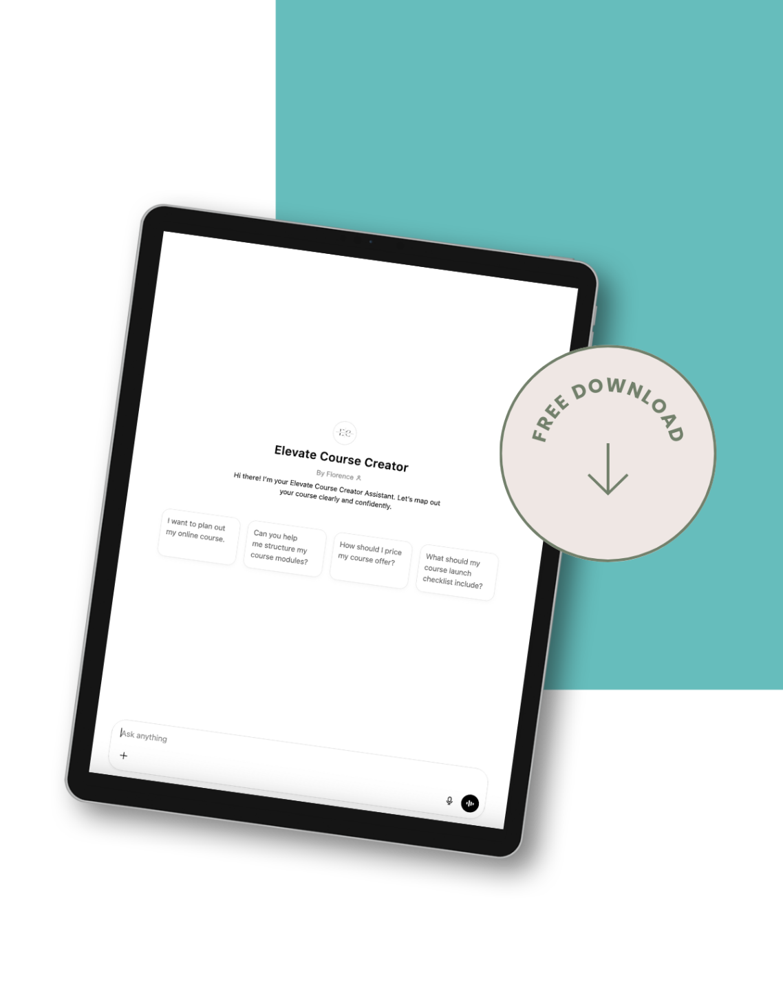
Get Your Free Course Planning Tool Now!
4. Missing or Misplaced Email Automations
Kajabi makes it easy to automate your marketing—but many creators either don’t use this feature at all or set it up incorrectly.
Common problems:
-
No welcome sequence for new subscribers
-
Abandoned cart emails not turned on
-
No follow-up after a course purchase
Fix it:
Set up automations that guide your customer through the journey. At minimum:
-
A lead magnet thank-you sequence (3–5 emails)
-
A warm-up sequence before your launch
-
Post-purchase emails with onboarding steps
📩 Kajabi’s visual email automations let you trigger sequences based on form submissions, purchases, and tags—no extra tools needed.
5. Ignoring Mobile Optimisation
Over half of your traffic is likely coming from mobile—and if your Kajabi site isn’t optimised for mobile, you're losing sales.
Common problems:
-
Long paragraphs and tiny fonts
-
Buttons too small to tap
-
Cluttered design on smaller screens
Fix it:
Preview every landing page, sales page, and checkout page in Kajabi’s mobile view before publishing. Use large, tappable buttons and short, punchy text that works on small screens.
📱 Bonus tip: Kajabi’s newer templates are more mobile-friendly, so switching to a modern theme can instantly improve UX.
Final Thought: Small Fixes = Big Sales Gains
You don’t need to overhaul your entire Kajabi site. Just fixing a few key mistakes can dramatically increase conversions, build trust with your audience, and create a smoother path to purchase.
Take 30 minutes today to review your setup with fresh eyes. Start with your homepage, offer page, and email sequences. Then layer in SEO and mobile optimisation.
Each improvement builds on the next—and the compounding effect can be huge.


